
You already know that your countertops are a work of art. It may come to no surprise to you that Art is one of the subjects covered under Cameo Courses! In this lesson, you will learn how to correctly utilize colors to create your ideal aesthetic, making your custom countertops pop!
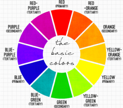
Do you remember learning about the color wheel in school? A color wheel is a tool used by artists to organize colors based on the relationship between color values. The basis of the color wheel are the three primary colors, spaced evenly apart. Directly between each primary color is the secondary color created by combining them. Colors opposite each other on the wheel are considered complement colors. For instance, purple is the complement to yellow. They contrast one another to make both colors pop. If used correctly, they can strategically help create a gorgeous aesthetic. However, if not careful, they can work against the design.
Contrasting colors emphasize each other. Say you have cabinets with a red undertone. Pairing them with a countertop with green flecks will bring out both the red undertone and draw attention to the green flecks. This is because green and red are contrast colors on the wheel. On the other hand, if you do not want to emphasize the red undertones, you can choose a countertop with shades of red. Pairing colors becomes tricky when considering more subtle undertones. Picture rust colored granite countertops. Against a tan wall with red/orange undertones, the beauty of the countertops may go unnoticed. However, choose a tan with a green undertone and the countertops will sparkle. Both scenarios have the same countertops with tan walls. the difference between stunning and boring lies within the undertones. Contrast colors can be used strategically to add drama where desired, or soften an undertone when necessary.
Even if you choose a neutral color scheme, you should incorporate a variation of shades of your chosen color. If you do not add some contrasting colors, the room will appear dull. For instance, if you choose a shade of beige as the basis of your design, you can add pops of brown or white to create a contrast. Doing this will allow you to keep a neutral color scheme, while having vibrance in the room. Furthermore, a popular technique is to use an abundance of one color in an area to pull out one specific color in another piece in the room. For example, if you have a granite countertop with flecks of gold in it, you can make the gold in your granite countertops more dramatic by adding gold to your cupboards and accent pieces. Say you spring for an all white kitchen. The goal of your aesthetic may be entirely white, but you can still sneak in some contrast. A great way to do this, for instance, is to choose countertops with veining. A color such as Blue Carrara quartz is white, with mild blue veining. The pattern of this color is enough to liven up an otherwise dull room. Even with neutral themes, contrasting colors are crucial to creating a beautiful design.
No matter the shade that you choose on the color wheel, you can have a beautiful aesthetic! We offer countertops in a myriad of colors, shades, and patterns. With that being said, you can have your absolute favorite color. Regardless of your chosen color for countertops, you now know how to incorporate them into a room and create a gorgeous look. We cannot wait to help you customize your dream countertops in your favorite color!